
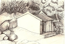
 The original scanned-in drawing - looks much lighter than original
Colours adjusted slightly to reflect original
 Colours adjusted somewhat more
 Sepia toned
Colours adjusted to fiery orange tones
I am super busy during the week now building up my PR and marketing business, so only have a small amount of time each week to be creative. Yesterday it rained heavily, which was the perfect excuse to do some sketching and then play around on paint.net. Which version of this illustration do you like best?


Lovely drawing ;) To be honest, I really like it lighter, as it looks at the first scanned image. It gives her a very enchanting and eerie beauty. Either way, I find it wonderful.
ReplyDeleteThank you! I think I like the 2nd one best. I love your work Rouble Rust. I think everyone who has a little dark side to them will love it too.
ReplyDeletei like the first one best, as it looks light and reflects the softness of her face. I love the way you've drawn the plait x
ReplyDelete